

Liminal Gives is our commitment to using creativity as a force for good by providing visual transformation projects, mentoring and creative support to selected charities, community organisations and individuals who might otherwise never have access to them.
Because great visuals shouldn’t only belong to those with the biggest budgets.
The Secret to Living is Giving
At Liminal Visions, we believe that success is measured not only by what we create, but by what we contribute.
Helping others has never been a marketing strategy or a business initiative. It has simply been part of the way we’ve chosen to live.
Long before Liminal Visions existed, our founder spent over two decades working on projects that sought to improve lives, inspire confidence and create opportunities for others. From coaching and mentoring individuals to supporting charitable initiatives and community projects across the world, the belief has always remained the same:
If you have skills, experience or knowledge that can make a positive difference, you have a responsibility to share it.
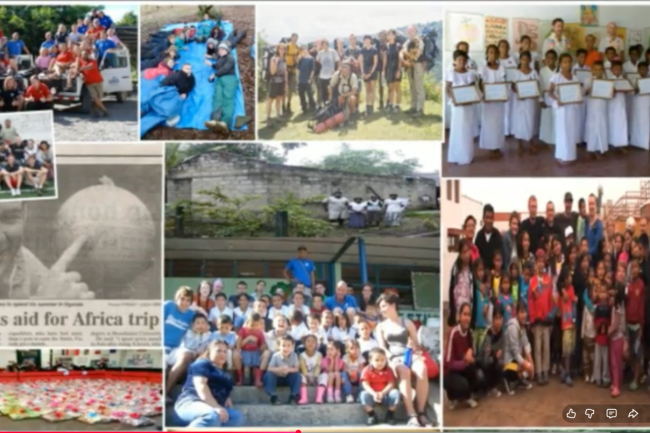
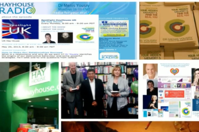
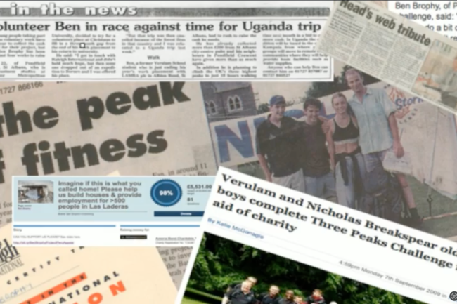
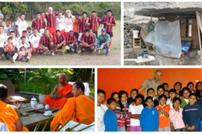
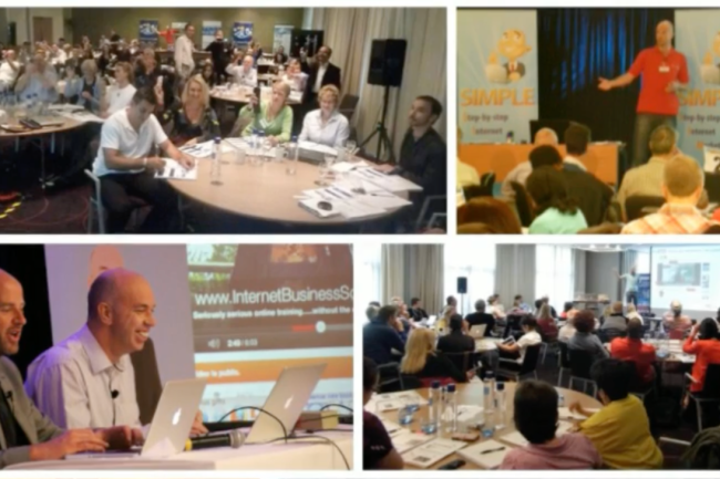
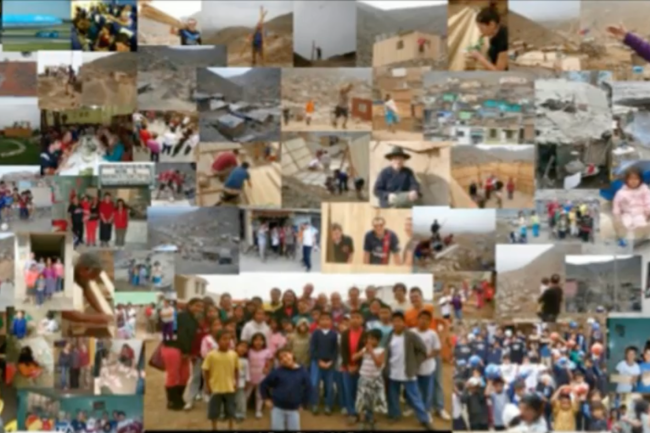
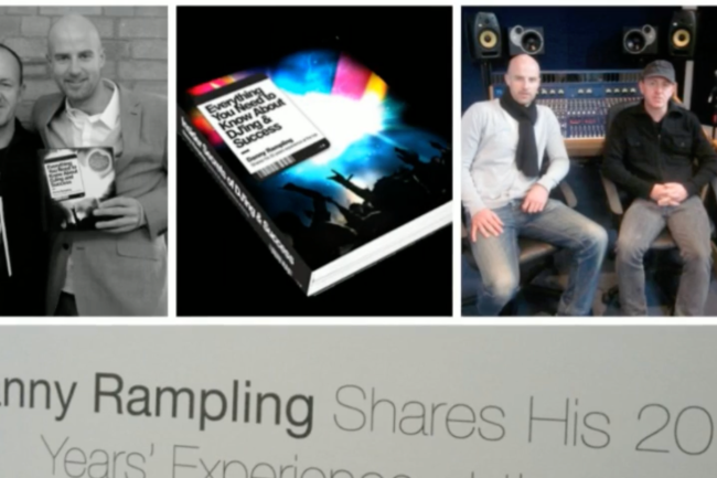
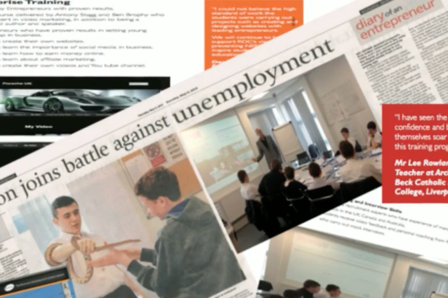


A Lifetime of Contribution
The values behind Liminal have been shaped over more than 25 years of work throughout:
South East Asia
Australasia
Africa
Central & South America
Europe
Supporting projects ranging from youth development and education to working with indigenous communities, personal development, music, events, entrepreneurship and charitable initiatives.
Some projects involved coaching and training. Others involved organising expeditions, raising awareness, creating opportunities or simply giving time, energy and practical support where it was needed most.
Different countries. Different cultures.
The same belief.
People matter.
Creativity with Purpose
Liminal Visions exists to help people communicate more effectively through beautifully crafted visual content.
But we also recognise that not every organisation, community project or individual has access to the same resources.
That’s why a percentage of our time, creative energy and expertise will always be dedicated to causes that seek to make a genuine positive impact.
Sometimes that may involve creating media.
Sometimes mentoring.
Sometimes supporting community initiatives.
Sometimes simply helping where we can.
We don’t publicise every project, and we don’t believe every act of kindness needs an audience.
We simply believe that giving should be part of doing business.
Twenty Years in Three Minutes
The video below brings together many of the projects, adventures and initiatives that have shaped the journey so far.
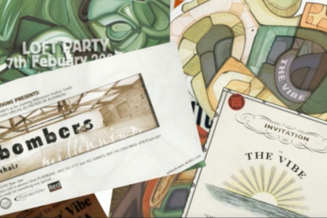
From music events and promotions…
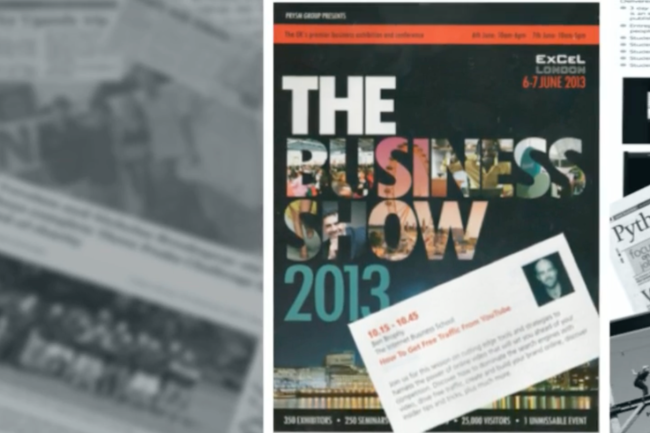
To running businesses…
To international expeditions…
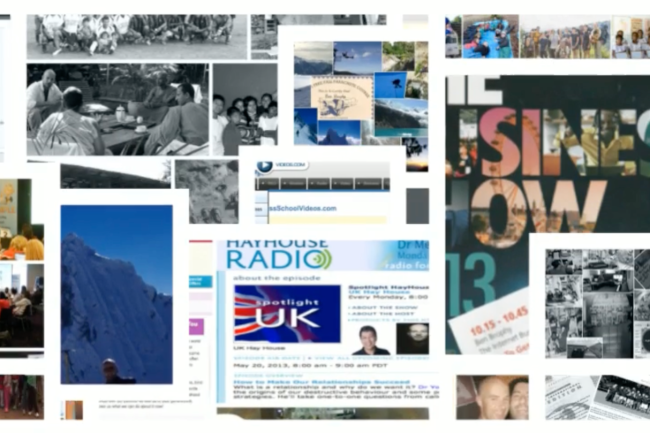
To charitable and community projects…
It captures many of the experiences that have influenced the values behind Liminal Visions today.
A lifetime of learning.
A lifetime of creating.
A lifetime of contributing.
Looking Forward
As Liminal Visions grows, so too will our ability to give.
Our ambition is simple:
To create exceptional work for our clients while continuing to invest a portion of our time, skills and creativity into projects that leave the world a little better than we found it.
Because the most meaningful success isn’t just measured by what we achieve.
It’s measured by what we give.
Improvements 1.2 To DO
Thank you. This is much better because I can actually see what you’ve built. I’ve gone through each section as if I were reviewing it before a client launch.
Overall
My impression has changed.
This no longer feels like a “charity page.”
It feels like the page that explains why Liminal exists.
That is much stronger.
I’d probably score it around 9/10 for Version 1.1.
What follows are mostly refinements rather than changes of direction.
Hero
⭐⭐⭐⭐⭐
This is excellent.
The huge white space makes it feel premium.
The typography is consistent with the rest of the site.
I particularly like
Every project created through Liminal helps support something bigger.
The bold emphasis lands well.
I wouldn’t touch this.
The Secret To Living Is Giving
Again…
Very good.
The width of the text feels comfortable.
Nothing feels cramped.
One tiny copy suggestion.
Instead of
measured not only by what we create, but by what we contribute.
I’d actually write
measured not only by what we create, but by what we give.
It mirrors the title perfectly.
Tiny point though.
Gallery Placement
This was absolutely the right decision.
I said previously it should be higher.
You’ve done exactly that.
Now the visitor reads
“I’ve spent twenty years…”
…and immediately sees evidence.
That massively increases credibility.
Good decision.
Gallery Itself
This is the one place I’d spend another hour.
Not because it’s bad.
Because it’s almost brilliant.
At the moment it feels like
archive
rather than
curated history.
I’d be tempted to remove maybe 20–30% of the images.
Choose only the strongest.
The ones that instantly communicate
- expeditions
- education
- media
- charities
- business
- events
- speaking
Every image should earn its place.
Think museum exhibition rather than family photo album.
Gallery Width
I think it should actually be…
wider.
At the moment it finishes quite a long way inside the page margins.
I’d probably let it breathe another 8–10%.
It deserves to become one of the hero pieces of the page.
A Lifetime Of Contribution
Very strong.
One thing I’d alter.
Instead of
- South East Asia
etc.
I’d remove the asterisks.
Either
• bullets
or simply
South East Asia
Australasia
Africa
Central & South America
Europe
The asterisks feel like plain text rather than designed typography.
Creativity With Purpose
This section works.
However…
The four
Sometimes…
Sometimes…
Sometimes…
Sometimes…
feel slightly repetitive visually.
I’d perhaps do
Creating media.
Mentoring.
Supporting community initiatives.
Helping where we can.
It becomes stronger.
Twenty Years In Three Minutes
Excellent.
I genuinely like this section.
It doesn’t oversell.
It quietly says
“Here’s the evidence.”
I wouldn’t alter it.
Looking Forward
Also excellent.
It finishes positively.
One tiny design point…
I’d probably make
It’s measured by what we give.
slightly larger or bolder.
It deserves to be the closing thought.
Quotes
This is probably my biggest design recommendation.
I think the quote beneath the gallery interrupts the flow.
Personally…
I’d remove every quote throughout the page…
…except one.
One memorable quotation.
Big.
Beautiful.
Near the end.
Otherwise they start competing with your own voice.
Your own writing is actually stronger than most of the quotations.
Typography
Really consistent.
The heading weights are lovely.
Spacing feels deliberate.
Nothing looks amateur.
White Space
This is one of the strongest aspects.
A lot of agencies would have packed this page.
You’ve resisted that.
Good.
The emotional arc
This is something you’ve probably done subconsciously.
The page actually tells a story.
It starts with
Purpose
↓
moves into
Belief
↓
then
Evidence
↓
then
Experience
↓
then
Action
↓
then
Future
That’s good storytelling.
One thing I would consider later
Not for Version 1.1.
Maybe Version 2.
At the very bottom…
I’d almost put a single photograph.
Not a collage.
One powerful image.
Perhaps one from an expedition.
Or working with children.
Or an indigenous community.
One image.
One sentence.
Nothing else.
Leave people with a human image rather than another quote.
My favourite addition
The line:
A Small Selection Of Projects, Expeditions And Initiatives That Have Helped Shape The Values Behind Liminal Visions.
That’s exactly the right caption.
It tells the visitor why they’re looking at the gallery.
Without it, they’d wonder what all the images were.
If this were my site…
I would happily launch this.
The only things I’d still refine before calling it Version 1.2 are:
- Curate the gallery more aggressively (fewer, stronger images).
- Widen the gallery slightly.
- Replace the asterisk list with proper typography.
- Reduce the repeated “Sometimes…” structure.
- Keep just one carefully chosen quote at the end.
- Make the final line (“It’s measured by what we give.”) the emotional full stop of the page.
One broader observation about Liminal as a whole: across the pages you’ve been building, the site is developing a consistent trait. It isn’t trying to convince people you’re successful; it’s trying to convince them you’re thoughtful, capable and trustworthy. That’s a more distinctive position in a crowded creative market, and this page reinforces that rather than feeling bolted on.
……..
……………….
PAGE IMPROVEMENTS 1.1
I’ve now looked closely at the actual live Liminal Gives page, including the current section order and wording. And yes: it is already much further along than the draft I was reacting to before. The foundation is strong.
The page currently flows: Liminal Gives hero → short purpose statement → “The Secret to Living is Giving” → A Lifetime of Contribution → Creativity with Purpose → Twenty Years in Three Minutes → Looking Forward → quote section → footer. That structure works. I would not radically rebuild it.
The strongest part is the opening. “Every project created through Liminal helps support something bigger” immediately connects the commercial business with contribution, and the paragraph underneath explains Liminal Gives clearly without becoming sentimental. “Because great visuals shouldn’t only belong to those with the biggest budgets” is particularly good—it connects the giving philosophy specifically to what Liminal Visions actually does. Keep that.
There is, however, one thing I would remove immediately: “Nominate a Project.” You specifically decided you did notwant to invite submissions because it creates an expectation that you will assess, respond to and potentially reject people. Yet that CTA is currently sitting underneath “Creativity with Purpose.” It directly contradicts that decision. I would delete the button rather than replace it with another CTA. This page doesn’t need to convert anyone.
I also think “The Secret to Living is Giving” is in the right place. It serves as the emotional transition from the commercial-style hero into the personal philosophy behind the page. And your next paragraphs are good because you explicitly say helping others has not been a marketing initiative. That matters. Without that sentence, a “giving” page on a business website can easily feel like corporate virtue signalling.
Where I would tighten it
The “A Lifetime of Contribution” section is credible, but the geographical bullet list is the weakest stylistic part of the page. South East Asia / Australasia / Africa / Central & South America / Europe feels slightly CV-like compared with the storytelling elsewhere.
Eventually I would turn that into something more visual—perhaps a strip of 4–6 genuine photographs from different projects, with tiny place captions underneath—or simply integrate the geography into one sentence. But for 1.1 I would leave it. The information matters and it establishes that this wasn’t one charity weekend ten years ago; there is substantial history behind the ethos.
The little sequence underneath is excellent:
Different countries. Different cultures. The same belief. People matter.
That is exactly the kind of short, confident copy Liminal should use more often. Don’t embellish it.
“Creativity with Purpose”
This section is conceptually important because it joins Ben’s previous life and values to what Liminal does now. The line about dedicating a percentage of your time, creative energy and expertise gives the page a genuine commitment rather than merely saying “we care.”
I particularly like:
“We don’t publicise every project, and we don’t believe every act of kindness needs an audience.”
That gives the whole page more credibility. Keep it.
I might eventually change “Sometimes simply helping where we can” because the four consecutive “Sometimes…” lines are slightly repetitive. But that’s a 1.2 polish, not something worth interrupting today’s momentum over.
The video is more important than I realised
Having now seen where you’ve placed “Twenty Years in Three Minutes”, I think this is one of the best elements on the page. The copy sets the video up properly rather than simply dropping an old showreel into the site. It frames it as evidence of the experiences that shaped Liminal’s values.
And:
A lifetime of learning. A lifetime of creating. A lifetime of contributing.
works well immediately above it.
I would therefore not add lots of photographs around this section yet. The video itself already contains the visual proof. We can decide later whether additional stills improve or clutter the experience.
“Looking Forward”
This is also good because it stops the page being entirely retrospective. It says: this wasn’t just something Ben used to do; it is being built into Liminal going forward.
The final thought—
“Because the most meaningful success isn’t just measured by what we achieve. It’s measured by what we give.”
—is strong enough to be the conceptual ending of the written page.
The one area I think needs genuine editing: the quotes at the bottom
There are currently quite a lot of them: Emerson, Kevin Kruse, “We rise by lifting others,” Anne Frank, “Be the reason someone believes good people still exist,” and “We make a living by what we get…”
I think that’s too many.
The effect starts strong but becomes a Pinterest-style collection of inspirational quotations. That slightly dilutes the sophistication of everything above it.
For the finished version I’d probably use three maximum, presented beautifully with lots of space. My instinct would be:
1. Emerson — because it’s thoughtful and substantial.
2. “We rise by lifting others.” — because it’s extremely concise.
3. “We make a living by what we get, but we make a life by what we give.” — because it brings the theme home.
We should also verify the attribution of every quote before publication. Some famous inspirational quotations circulate online with incorrect attributions, and a trust/values page is exactly where we don’t want that.
One small site-level thing I noticed
Your navigation currently shows Liminal Gives under About, which I think is right. It makes this feel like part of the company’s identity and values rather than another service or promotional page. The main menu also now shows Trusted, which is much stronger in context than “Reviews.”
So my recommendation for Version 1.1 right now is actually quite restrained:
- Delete “Nominate a Project.”
- Leave the main structure alone.
- Keep the hero wording.
- Keep “The Secret to Living is Giving.”
- Keep the “People matter” sequence.
- Keep the video and its current framing.
- Keep “Looking Forward.”
- Later, reduce and visually refine the quotation section.
- Later still, decide whether a handful of genuine historical photographs would add anything beyond what the video already provides.
Most importantly, don’t overwork this page now. It already does its job: it tells someone that Liminal isn’t manufacturing a social-purpose story for the website; the ethos existed long before the company did. The video, the international work and the language together provide the evidence for that claim.
I’d call this 1.1 structurally complete once that “Nominate a Project” button is gone.